Repository navigation
Handling of long prefLabels in alphabetical listing deteriorates visual UE #788
Description

As can be seen from the above image, long prefLabels in alphabetical listing cause confusion amongst users due to lack of visual differentiation between concepts.

Note that the same does not apply to hierarchical view as there is a visual aide in the form of the tree:

Activity
[-]Long prefLabels in alphabetical listing deteriorate visual UE[/-][+]Handling of long prefLabels in alphabetical listing deteriorate visual UE[/+][-]Handling of long prefLabels in alphabetical listing deteriorate visual UE[/-][+]Handling of long prefLabels in alphabetical listing deteriorates visual UE[/+]joelit commentedon Nov 19, 2019
So far so good! Some work is still needed - the logic doesn't work quite the same in the following cases:
When the prefLabel is longer than column width, it is displayed on two lines with an indentation as shown above. This is good and true.
When the string representation of altLabel --> prefLabel is longer than column width, the element containing the prefLabel is represented as an inline text block on a separate line from the representation of the altLabel, but this time without the indentation. (See the attached image for clarity)
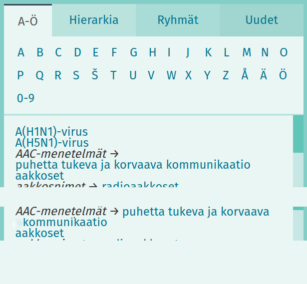
The list of prefLabels will contain a mix of multi-line blocks for long prefLabels, and simple links for shorter prefLabels. This means the longer labels are clickable for the whole line, whereas the shorter labels are clickable only from the text. These links should IMO be all handled in the same manner, or at least check the proposed solution won't break the UI e.g. for a tablet user.
I say this PR needs some tweaking, and is best left for in version 2.3.