



A powerful Flutter package for creating complex, resizable, multi-pane layouts. Ideal for building IDE-like interfaces, advanced dashboards, and desktop applications.
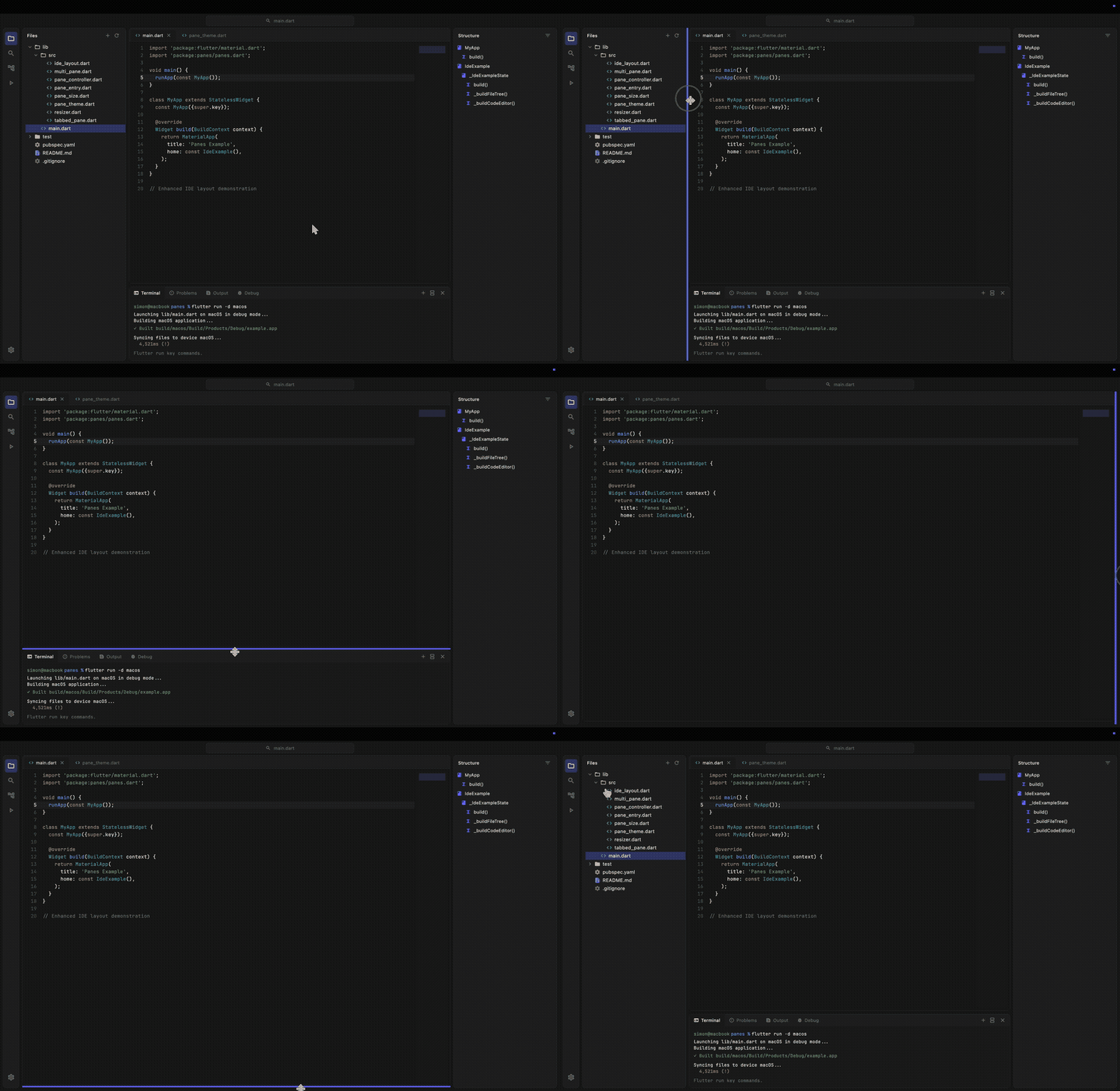
- 🪟 Flexible Layouts: Create complex arrangements with resizable horizontal and vertical panes.
- 📱 Responsive: Works great on Desktop and Web, providing a native-feeling experience.
- 🎨 Theming: Fully customizable appearance using
PaneThemeto match your app's design. - ⌨️ Programmatic Control: Show, hide, maximize, and resize panes using
PaneController. - ➕ Dynamic Management: Add, remove, or update panes at runtime without losing state.
- 💾 Save/Load State: Serialize and restore layout configurations with
save()andload(). - 📑 Tabbed Interfaces: Built-in support for tabbed panes with icons and action buttons.
- 🖱️ Customizable Resizers: Control the thickness, color, and hit-test area of split handlers.
- ⌨️ Keyboard Accessibility: Resizers are focusable (Tab) and controllable with Arrow keys.
- 🔄 Reset & Maximize: Double-tap resizers to reset sizes, or maximize any pane to full area.
Add panes to your pubspec.yaml:
dependencies:
  panes: ^1.0.0
Or run:
flutter pub add panesMultiPane gives you full control to build arbitrary split-view layouts (horizontal or vertical, nested, etc.). This is the core widget of the package.
- Define your panes:
final controller = PaneController(
  entries: [
    PaneEntry(
      id: 'sidebar',
      initialSize: PaneSize.pixel(250),
      minSize: PaneSize.pixel(100),
      autoHide: true,
    ),
    PaneEntry(
      id: 'content',
      initialSize: PaneSize.fraction(1.0),
    ),
  ],
);- Render the MultiPane:
MultiPane(
  direction: Axis.horizontal,
  controller: controller,
  paneBuilder: (context, id) => switch (id) {
    'sidebar' => Sidebar(),
    'content' => Content(),
    _ => const SizedBox(),
  },
)PaneController allows you to modify the layout at runtime:
// Add a new pane at the end
controller.addPane(
  PaneEntry(
    id: 'new-panel',
    initialSize: PaneSize.fraction(0.5),
  ),
);

// Add at a specific position
controller.addPane(entry, index: 1);

// Remove a pane and clean up its state
controller.removePane('new-panel');

// Update pane constraints (e.g., change minSize)
controller.updatePane(
  entry.copyWith(minSize: PaneSize.pixel(200)),
);For common IDE-like structures, IdeLayout provides a pre-configured setup with sidebars and a center area.
import 'package:flutter/material.dart';
import 'package:panes/panes.dart';

void main() {
  runApp(const MaterialApp(home: MyIde()));
}

class MyIde extends StatefulWidget {
  const MyIde({super.key});

  @override
  State<MyIde> createState() => _MyIdeState();
}

class _MyIdeState extends State<MyIde> {
  late final IdeController _controller;

  @override
  void initState() {
    super.initState();
    _controller = IdeController(
      leftSize: PaneSize.pixel(250),
      rightSize: PaneSize.pixel(250),
      bottomSize: PaneSize.pixel(150),
    );
  }

  @override
  Widget build(BuildContext context) {
    return Scaffold(
      body: IdeLayout(
        controller: _controller,
        // Left Sidebar (e.g., File Explorer)
        leftPanelBuilder: (context) => Container(
          color: Colors.grey[200],
          child: const Center(child: Text('Explorer')),
        ),
        // Center Area (e.g., Code Editor)
        centerBuilder: (context) => Container(
          color: Colors.white,
          child: const Center(child: Text('Editor')),
        ),
        // Right Sidebar (e.g., Outline)
        rightPanelBuilder: (context) => Container(
          color: Colors.grey[200],
          child: const Center(child: Text('Outline')),
        ),
        // Bottom Panel (e.g., Terminal)
        bottomPanelBuilder: (context) => Container(
          color: Colors.black,
          child: const Center(
            child: Text('Terminal', style: TextStyle(color: Colors.white)),
          ),
        ),
      ),
    );
  }
}IdeController.bottomLayout controls where the bottom panel sits relative to the side panes. You can set it in the constructor or change it at runtime. Pane sizes, visibility, and widget state carry over when it changes.
contained (default)        fullWidth
┌────┬────────┬─────┐      ┌────┬────────┬─────┐
│    │ editor │     │      │left│ editor │right│
│left├────────┤right│      ├────┴────────┴─────┤
│    │ bottom │     │      │      bottom       │
└────┴────────┴─────┘      └───────────────────┘

extendLeft                 extendRight
┌────┬────────┬─────┐      ┌────┬────────┬─────┐
│left│ editor │     │      │    │ editor │right│
├────┴────────┤right│      │left├────────┴─────┤
│   bottom    │     │      │    │    bottom    │
└─────────────┴─────┘      └────┴──────────────┘
final controller = IdeController(bottomLayout: IdeBottomLayout.fullWidth);

// Switch at runtime
controller.bottomLayout = IdeBottomLayout.extendLeft;
In extendLeft and extendRight, the extended side pane moves from rootController to topController. Use the layout-aware helpers rather than assuming which controller holds a pane:
controller.controllerOf(IdePane.left).resetSize(IdePane.left.id);

// Maximize a pane to fill the whole layout, in any bottom layout
controller.toggleMaximize(IdePane.bottom);
print(controller.maximizedPane); // IdePane.bottomIdeLayout provides callbacks to react to visibility and maximize state changes:
IdeLayout(
  controller: _controller,
  // Called when any pane's visibility changes
  onPaneStateChanged: (IdePane pane, bool isVisible) {
    print('$pane is now ${isVisible ? "visible" : "hidden"}');
  },
  // Called when maximize state changes (true = fully maximized)
  onMaximizeStateChanged: (bool isMaximized) {
    print('Maximized: $isMaximized');
  },
  // ... builders
)
The IdePane enum provides pane identifiers with embedded string IDs:
enum IdePane {
  left('left'),
  right('right'),
  bottom('bottom'),
  center('center'),
  centerContainer('centerContainer');

  final String id;

  const IdePane(this.id);
}Use TabbedPane to easily create a panel with tabs, headers, and actions.
TabbedPane(
  selectedIndex: _selectedIndex,
  onTabSelected: (index) => setState(() => _selectedIndex = index),
  labels: const ['Terminal', 'Output', 'Debug'],
  icons: const [Icons.terminal, Icons.text_snippet, Icons.bug_report],
  actions: [
    IconButton(
      icon: const Icon(Icons.add, size: 16),
      onPressed: () {},
    ),
  ],
  tabBuilder: (context, index) {
    return Center(child: Text('Content for tab $index'));
  },
)PaneThemeData is a ThemeExtension, so you can apply it via ThemeData:
MaterialApp(
  theme: ThemeData(
    extensions: [
      const PaneThemeData(
        resizerColor: Color(0xFF252526),
        resizerHoverColor: Color(0xFF007ACC),
        resizerFocusedColor: Color(0xFF005A9E),
        resizerThickness: 1.0,
        tabHeaderColor: Color(0xFF2D2D2D),
        tabBackground: Color(0xFF1E1E1E),
        tabSelectedBackground: Color(0xFF1E1E1E),
        tabLabelColor: Color(0xFF969696),
        tabSelectedLabelColor: Colors.white,
      ),
    ],
  ),
  home: MyApp(),
)
Alternatively, wrap your layout with PaneTheme for localized theming:
PaneTheme(
  data: const PaneThemeData(
    resizerColor: Color(0xFF252526),
    resizerHoverColor: Color(0xFF007ACC),
  ),
  child: IdeLayout(...),
)Check out the example directory for a complete IDE implementation that demonstrates how to build a JetBrains Fleet-like UI with the modern "Islands UI" design, featuring floating panels with rounded corners, file trees, and syntax highlighting placeholders using IdeLayout.
Contributions are welcome! If you find a bug or want a feature, please open an issue or submit a pull request.