






Note
Full tutorial on this library on YouTube. You can check it out here
Version 1.0.1 introduces the new SearchBarTheme class for better search bar customization:
- 🎨 SearchBarTheme - Consolidated theme class with
searchIconTint,clearIconTint,searchBorderColor,searchBorderColorUnfocused, andsearchBackgroundColor - ✨ itemSelectorColor - New parameter to customize selected item highlight color in picker
- 🐛 Bug Fixes - Fixed
searchBarColoranditemSelectedColornot being applied correctly
Migration from 1.0.0: Individual search styling properties (searchIconTint, clearIconTint, etc.) are now deprecated. Use the new searchBarTheme parameter instead.
- Purpose
- Features
- Demo
- Dependency
- Usage
- Customization
- Utility Functions
- Migration
- Sample App Examples
- Notes
- Contribute
- License
In various apps, we need to use a country code picker. There are several libraries available for this purpose. In XML we have a CCP created by hbb20, which is great. In Jetpack Compose there are few libraries but they lack some features and updates. So, I created this library to use in Jetpack Compose.
CountryCodePickerCompose is:
- ✨ Modern: Built with Jetpack Compose and Material 3 design
- 🎨 Beautiful: Follows Material Design 3 guidelines with proper elevation, spacing, and animations
- 🔧 Customizable: Highly configurable with multiple usage patterns
- 🌍 International: 19 language translations for country names
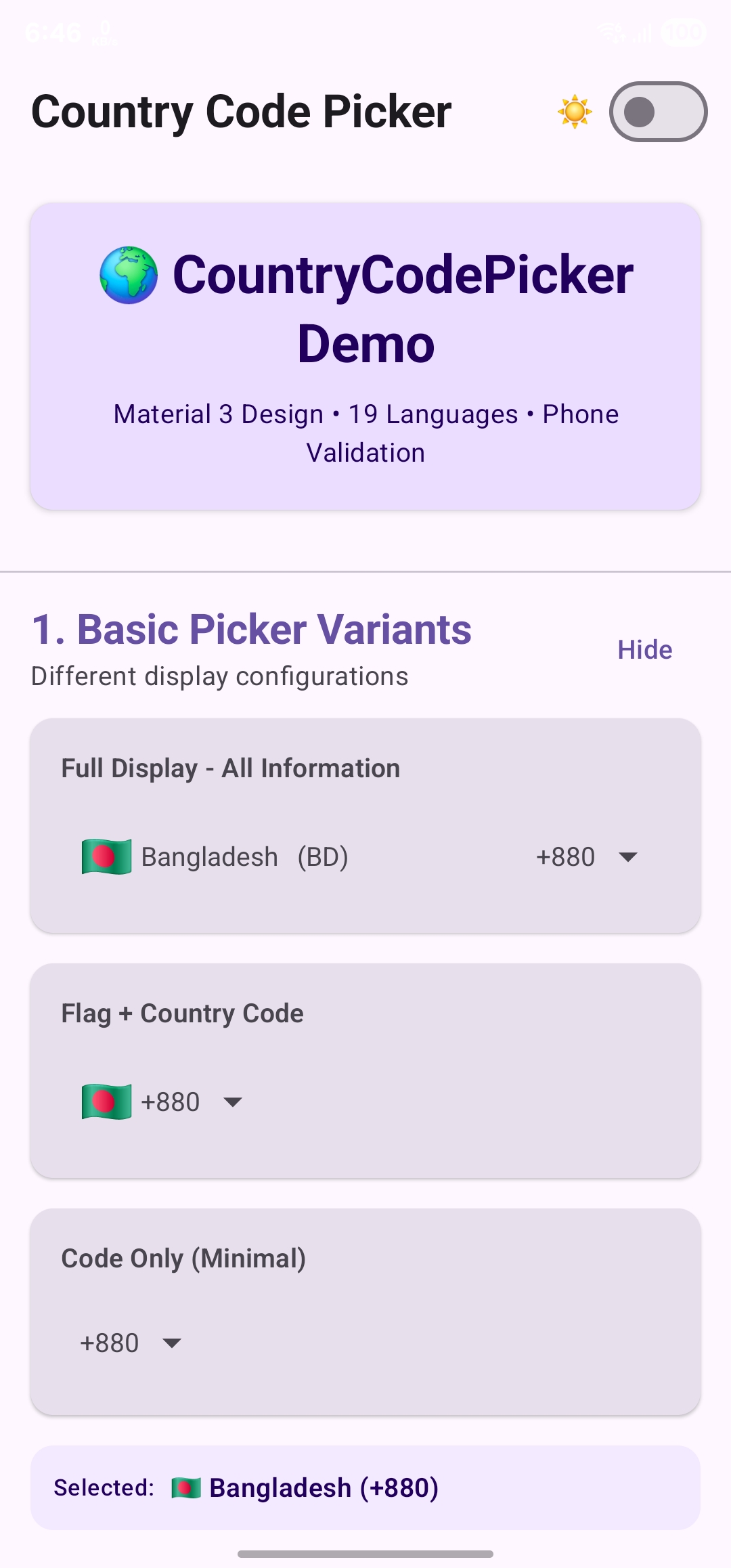
- 📱 Flexible: 4 different usage modes (View, TextField, Dialog, BottomSheet)
- 🛡️ Reliable: Comprehensive testing, proper error handling, production-ready
- Minimal & Lightweight: Optimized for performance with efficient code
- Emoji Flags: No image assets needed, uses native emoji flags
- 4 Usage Modes:
- As a View (Full Screen, Compact, or Attached to TextField)
- As a TextField (Integrated with OutlinedTextField)
- As a Dialog (Picker dialog overlay)
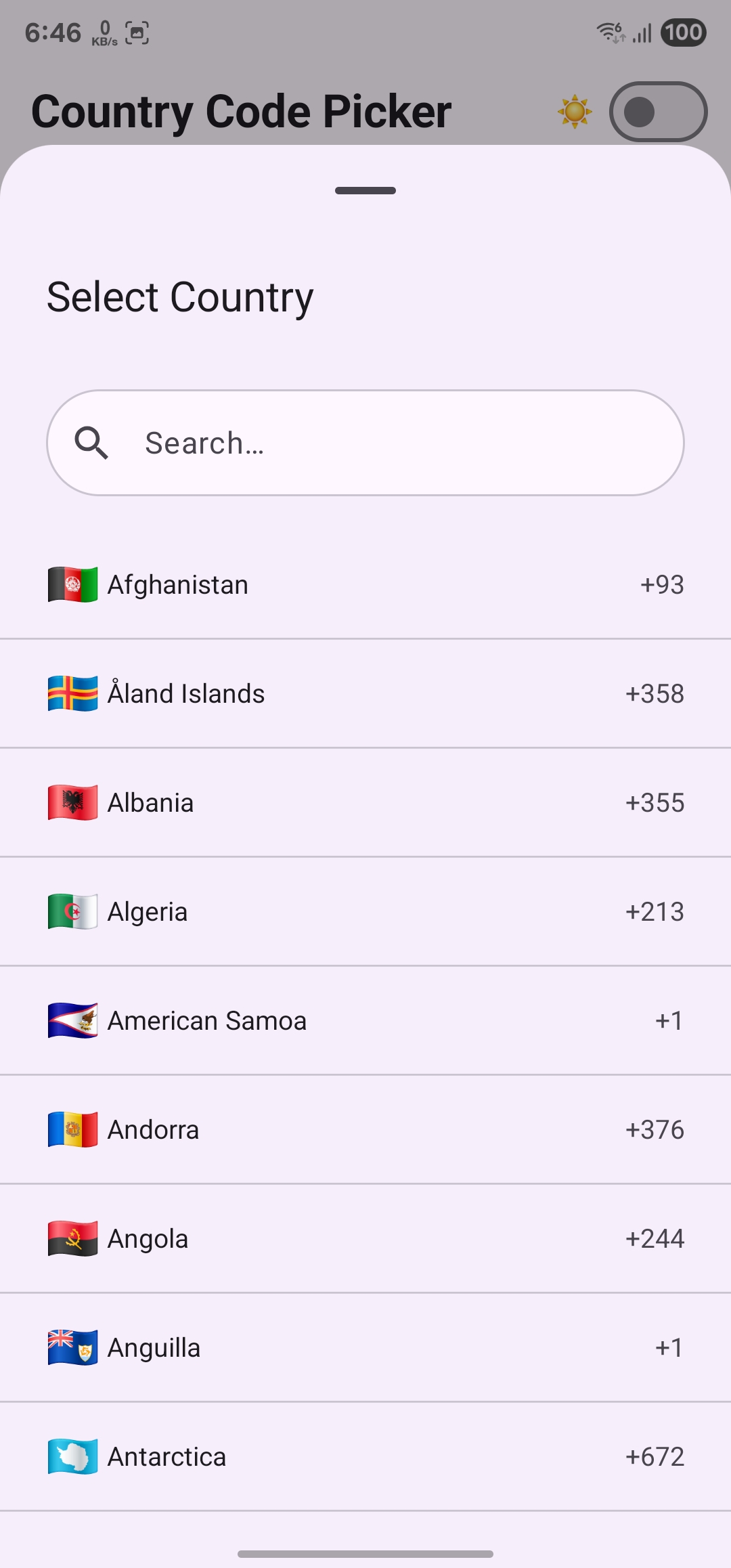
- As a BottomSheet (Material 3 bottom sheet)
- Automatic Detection: Detects user's country based on device settings
- Phone Validation: Built-in phone number validation using libphonenumber
- Visual Transformation: Automatic phone number formatting as you type
- Advanced Search: Search by country name, code, or phone number (e.g., "+12125551234")
- Material 3 Design: Complete Material You design system compliance
- 19 Languages: Country names available in multiple languages
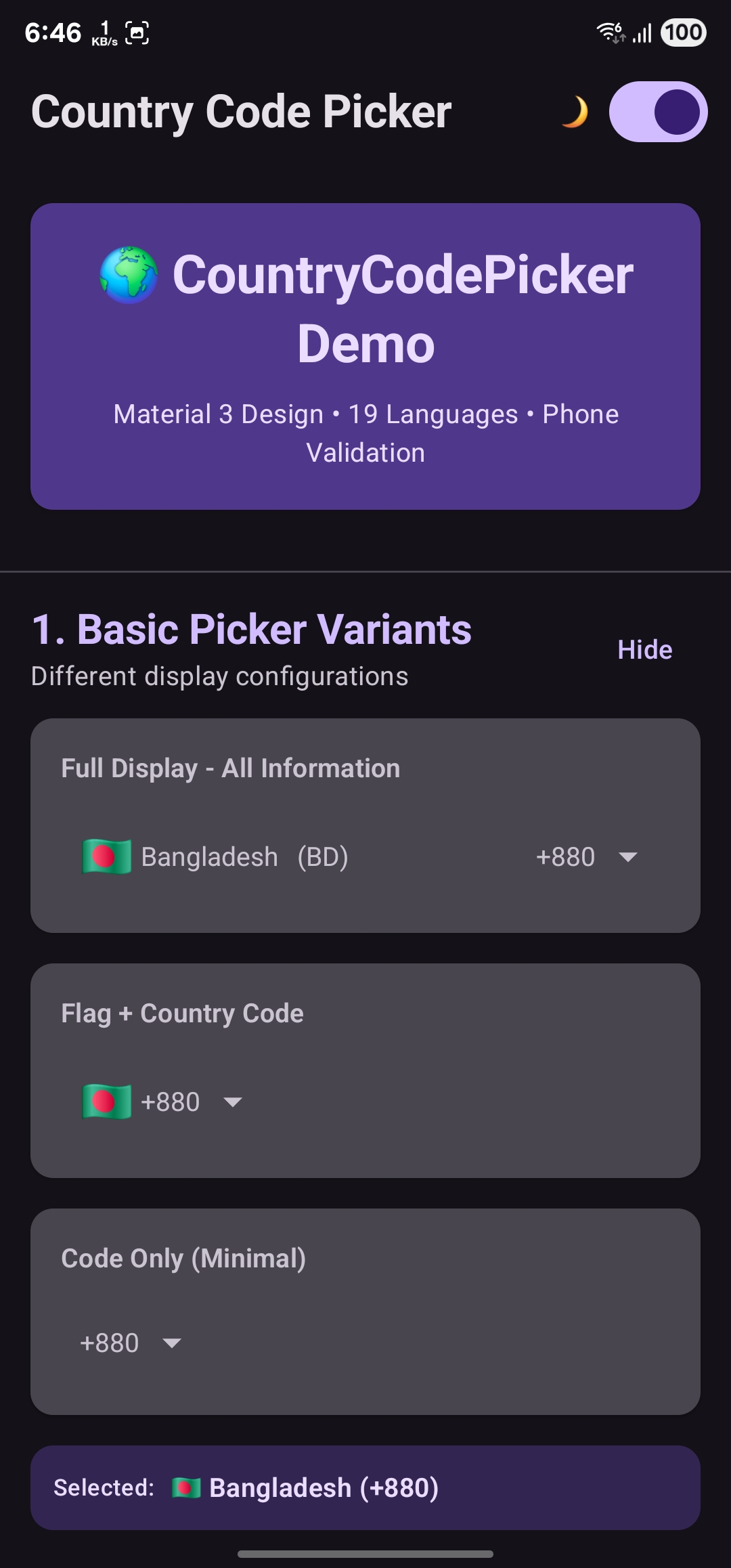
- Dark Mode: Full dark mode support with proper contrast
- Highly Customizable: Extensive customization options for all components
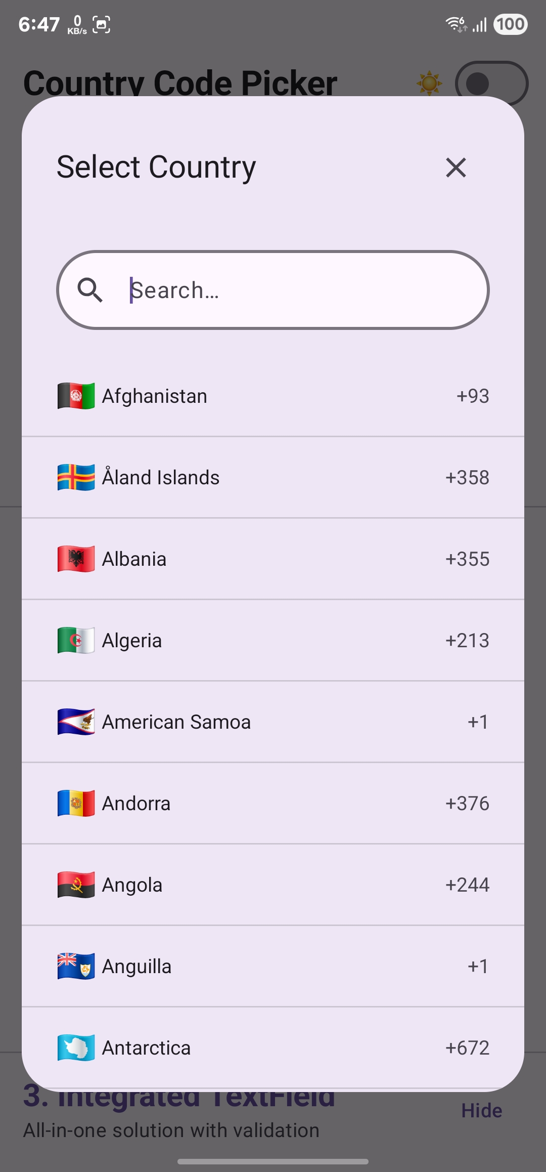
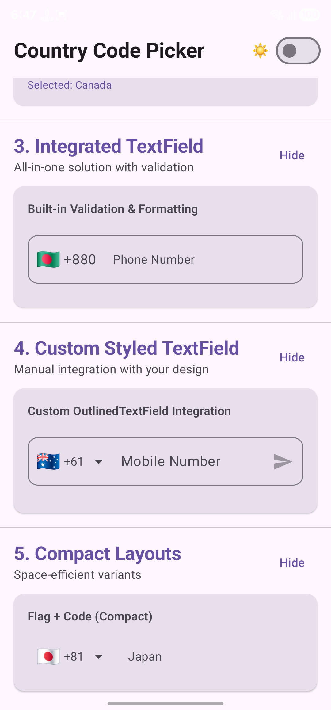
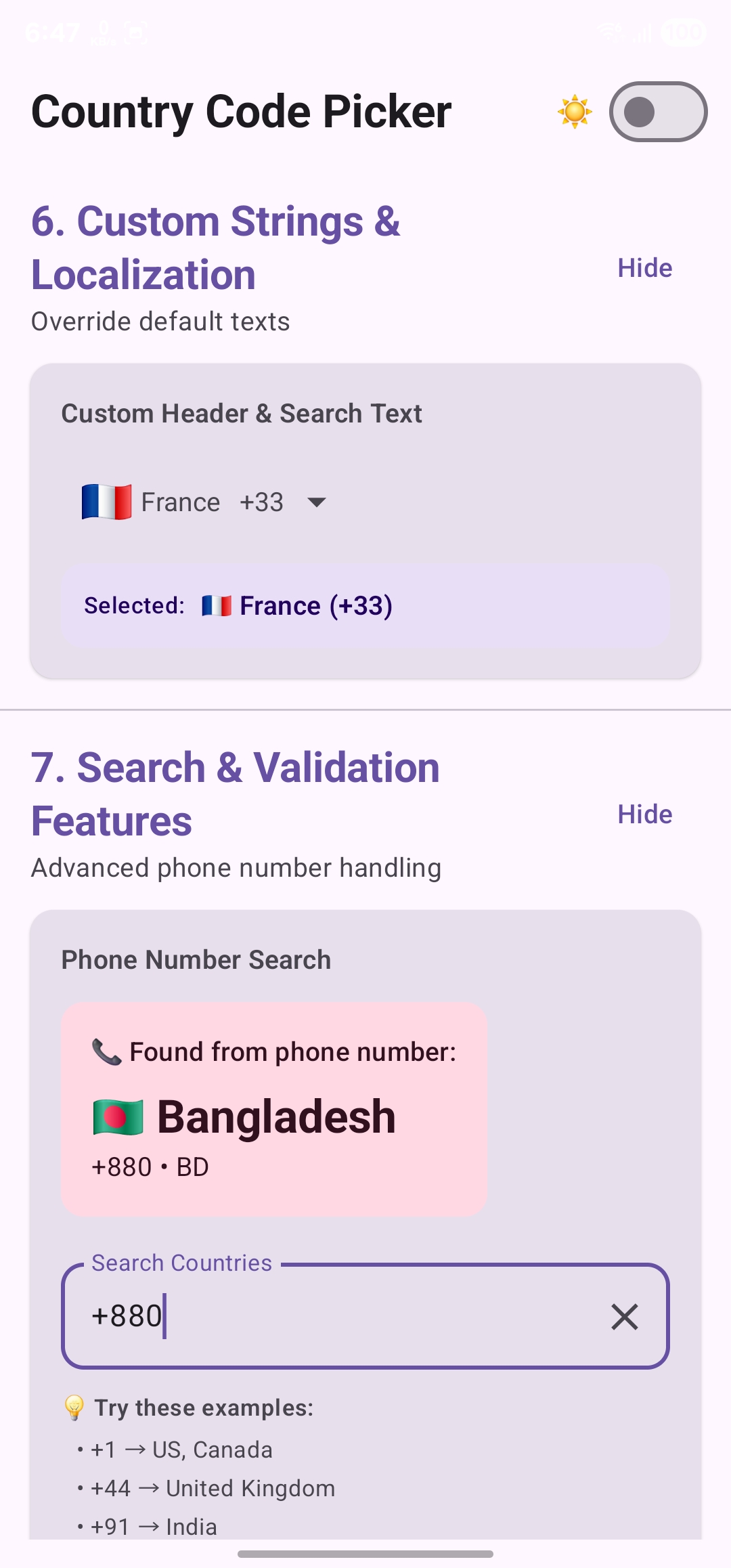
| Different Use Cases | Country Picker Dialog | Picker Bottom Sheet |
|---|---|---|
 |
 |
 |
 |
 |
 |
You can download the test apk to try out all features - Download APK
Add this to your module's build.gradle.kts file (latest version
dependencies {
    implementation("com.rejowan:ccpc:1.0.1")
}dependencies {
implementation 'com.rejowan:ccpc:1.0.1'
}There are 4 different ways to use this library:
- CountryCodePicker - Regular composable (can be used anywhere, attached to TextField)
- CountryCodePickerTextField - All-in-one TextField with integrated picker
- CountryPickerDialog - Standalone picker dialog
- CountryPickerBottomSheet - Material 3 bottom sheet picker
A flexible composable that can be used in multiple ways - as a standalone picker, attached to a TextField, or in custom layouts.
Basic Usage:
var selectedCountry by remember { mutableStateOf(Country.UnitedStates) }

CountryCodePicker(
    selectedCountry = selectedCountry,
    onCountrySelected = { selectedCountry = it },
    modifier = Modifier.fillMaxWidth()
)
Compact Mode (Flag + Code Only):
CountryCodePicker(
    selectedCountry = selectedCountry,
    onCountrySelected = { selectedCountry = it },
    viewCustomization = ViewCustomization(
        showFlag = true,
        showCountryIso = false,
        showCountryName = false,
        showCountryCode = true,
        showArrow = true
    ),
    showSheet = true  // Use bottom sheet (false for dialog)
)
Key Parameters:
selectedCountry: Country- Currently selected countryonCountrySelected: (Country) -> Unit- Callback when country is selectedshowSheet: Boolean- true for bottom sheet, false for dialog (default: false)viewCustomization: ViewCustomization- Customize the picker button appearancepickerCustomization: PickerCustomization- Customize the picker dialog/sheet
An all-in-one solution with integrated TextField, validation, and formatting.
Basic Usage:
var phoneNumber by remember { mutableStateOf("") }
var selectedCountry by remember { mutableStateOf(Country.UnitedStates) }

CountryCodePickerTextField(
    number = phoneNumber,
    onValueChange = { country, number, isValid ->
        selectedCountry = country
        phoneNumber = number
    },
    selectedCountry = selectedCountry,
    modifier = Modifier.fillMaxWidth(),
    label = { Text("Phone Number") },
    showError = true  // Show validation errors
)
With Custom Styling:
CountryCodePickerTextField(
    number = phoneNumber,
    onValueChange = { country, number, isValid ->
        selectedCountry = country
        phoneNumber = number
    },
    selectedCountry = selectedCountry,
    modifier = Modifier.fillMaxWidth(),
    shape = RoundedCornerShape(16.dp),
    textStyle = MaterialTheme.typography.bodyLarge,
    label = { Text("Enter Phone Number") },
    trailingIcon = {
        if (phoneNumber.isNotEmpty()) {
            IconButton(onClick = { phoneNumber = "" }) {
                Icon(Icons.Default.Clear, "Clear")
            }
        }
    },
    showError = true,
    showSheet = true
)
Key Features:
- Automatic phone number formatting as you type
- Real-time validation with visual feedback
- Integrated country picker (dialog or bottom sheet)
- Customizable styling and icons
A standalone picker dialog for manual integration.
Usage:
var selectedCountry by remember { mutableStateOf(Country.UnitedStates) }
var isDialogOpen by remember { mutableStateOf(false) }

// Your UI element to trigger the dialog
Button(onClick = { isDialogOpen = true }) {
    Text("Select Country")
}

// Dialog
if (isDialogOpen) {
    CountryPickerDialog(
        onDismissRequest = { isDialogOpen = false },
        onItemClicked = { country ->
            selectedCountry = country
            isDialogOpen = false
        },
        selectedCountry = selectedCountry,
        pickerCustomization = PickerCustomization(
            showCountryCode = true,
            showFlag = true
        )
    )
}A Material 3 bottom sheet picker with proper drag handle and keyboard support.
Usage:
var selectedCountry by remember { mutableStateOf(Country.UnitedStates) }
var isSheetOpen by remember { mutableStateOf(false) }

// Your UI element to trigger the sheet
Button(onClick = { isSheetOpen = true }) {
    Text("Select Country")
}

// Bottom Sheet
if (isSheetOpen) {
    CountryPickerBottomSheet(
        onDismissRequest = { isSheetOpen = false },
        onItemClicked = { country ->
            selectedCountry = country
            isSheetOpen = false
        },
        selectedCountry = selectedCountry,
        pickerCustomization = PickerCustomization(
            showCountryCode = true,
            showFlag = true
        )
    )
}
Features:
- Material 3 drag handle
- Proper keyboard handling (content stays visible)
- Smooth animations
- Optimized height (92% of screen)
Customize how the picker button/view appears:
data class ViewCustomization(
    var showFlag: Boolean = true,          // Show country flag emoji
    var showCountryIso: Boolean = false,   // Show country ISO code (e.g., "US")
    var showCountryName: Boolean = false,  // Show country name
    var showCountryCode: Boolean = true,   // Show country code (e.g., "+1")
    var showArrow: Boolean = true,         // Show dropdown arrow
    var clipToFull: Boolean = false        // Clip content to prevent overflow
)
Examples:
// Full display: Flag + Name + (ISO) + Code
ViewCustomization(
    showFlag = true,
    showCountryIso = true,
    showCountryName = true,
    showCountryCode = true
)

// Compact: Flag + Code only
ViewCustomization(
    showFlag = true,
    showCountryCode = true,
    showCountryName = false,
    showCountryIso = false
)

// Minimal: Code only
ViewCustomization(
    showFlag = false,
    showCountryCode = true,
    showArrow = true
)Customize the picker dialog/bottom sheet appearance:
data class PickerCustomization(
    var itemPadding: Int = 10,                           // Padding for list items
    var dividerColor: Color = Color.LightGray,           // Divider color between items
    var showSearchClearIcon: Boolean = true,             // Show clear button in search
    var showCountryCode: Boolean = true,                 // Show codes in list
    var showFlag: Boolean = true,                        // Show flags in list
    var showCountryIso: Boolean = false,                 // Show ISO codes in list

    // Custom text strings (can use string resources or direct strings)
    var headerTitle: Int = R.string.select_country,      // Dialog/sheet header
    var headerTitleText: String? = null,                 // Or use direct string
    var searchHint: Int = R.string.search,               // Search field hint
    var searchHintText: String? = null,                  // Or use direct string

    // Selected item highlight (new in 1.0.1)
    var itemSelectorColor: Color? = null,                // Background color for selected item

    // Search bar styling (new in 1.0.1)
    var searchBarTheme: SearchBarTheme? = null           // Theme for search bar (see below)
)

// SearchBarTheme for consolidated search bar styling
data class SearchBarTheme(
    val searchIconTint: Color? = null,                   // Tint for search icon
    val clearIconTint: Color? = null,                    // Tint for clear icon
    val searchBorderColor: Color? = null,                // Border color when focused
    val searchBorderColorUnfocused: Color? = null,       // Border color when unfocused
    val searchBackgroundColor: Color? = null             // Background color of search field
)
Examples:
// Custom strings for localization
PickerCustomization(
    headerTitleText = "Sélectionner un pays",  // French
    searchHintText = "Rechercher",
    showCountryCode = true
)

// Custom search field styling (new in 1.0.1)
PickerCustomization(
    itemSelectorColor = Color.LightGray,
    searchBarTheme = SearchBarTheme(
        searchIconTint = Color.Blue,
        clearIconTint = Color.Red,
        searchBorderColor = Color.Blue,
        searchBorderColorUnfocused = Color.Gray,
        searchBackgroundColor = Color.White
    )
)

// Minimal picker with codes only
PickerCustomization(
    showFlag = false,
    showCountryCode = true,
    showCountryIso = true
)Automatically detect the user's country based on their device settings:
var selectedCountry by remember { mutableStateOf(Country.UnitedStates) }

// Detect country on first composition
LaunchedEffect(Unit) {
    CCPUtils.getCountryAutomatically(context = LocalContext.current)?.let {
        selectedCountry = it
    }
}

// Or use in non-preview mode
if (!LocalInspectionMode.current) {
    CCPUtils.getCountryAutomatically(context = LocalContext.current)?.let {
        selectedCountry = it
    }
}
How it works:
- First tries to detect from SIM card (requires READ_PHONE_STATE permission)
- Falls back to device locale if SIM detection fails
- Returns null if country cannot be determined
Validate phone numbers using Google's libphonenumber library:
val context = LocalContext.current
val validator = remember(context) { CCPValidator(context = context) }

var phoneNumber by remember { mutableStateOf("") }
var isValid by remember { mutableStateOf(false) }

OutlinedTextField(
    value = phoneNumber,
    onValueChange = { newNumber ->
        phoneNumber = newNumber
        isValid = validator(
            number = newNumber,
            countryCode = selectedCountry.countryCode
        )
    },
    isError = phoneNumber.isNotEmpty() && !isValid,
    label = { Text(if (isValid) "Valid ✓" else "Phone Number") }
)
Features:
- Real-time validation as user types
- Country-specific number format checking
- Returns true for valid numbers, false otherwise
Automatically format phone numbers as the user types:
OutlinedTextField(
    value = phoneNumber,
    onValueChange = { phoneNumber = it },
    visualTransformation = CCPTransformer(
        context = LocalContext.current,
        countryIso = selectedCountry.countryIso
    ),
    keyboardOptions = KeyboardOptions(keyboardType = KeyboardType.Phone)
)
What it does:
- Formats numbers according to country-specific patterns
- Updates automatically when country changes
- Preserves underlying raw value
- Works with paste operations
Note: This is already integrated in CountryCodePickerTextField.
Find countries by phone number:
val context = LocalContext.current
var searchQuery by remember { mutableStateOf("") }
var foundCountry by remember { mutableStateOf<Country?>(null) }

OutlinedTextField(
    value = searchQuery,
    onValueChange = { query ->
        searchQuery = query
        // Find country from phone number
        foundCountry = if (query.startsWith("+")) {
            Country.findCountry(query, context)
        } else null
    },
    label = { Text("Enter phone number (e.g., +12125551234)") }
)

// Display result
foundCountry?.let { country ->
    Text("Country: ${country.countryName} (${country.countryCode})")
}
Features:
- Extracts country from phone number
- Works with full international numbers
- Returns null if country cannot be determined
Individual search styling properties are now deprecated. Migrate to searchBarTheme:
// OLD (1.0.0)
PickerCustomization(
    searchIconTint = Color.Blue,
    clearIconTint = Color.Red,
    searchBorderColor = Color.Blue
)

// NEW (1.0.1)
PickerCustomization(
    searchBarTheme = SearchBarTheme(
        searchIconTint = Color.Blue,
        clearIconTint = Color.Red,
        searchBorderColor = Color.Blue
    )
)// OLD (JitPack)
implementation("com.github.ahmmedrejowan:CountryCodePickerCompose:0.2")
// NEW (Maven Central)
implementation("com.rejowan:ccpc:1.0.1")✅ SearchBarTheme - Consolidated theme class for search bar styling
✅ itemSelectorColor - Customize selected item highlight color
✅ Bug fixes - Fixed searchBarColor and itemSelectedColor issues
If you encounter any issues during migration:
- Check the Changelog for detailed changes
- See the Sample App for updated examples
- Open an issue on GitHub
The included sample app demonstrates 7 comprehensive usage patterns with 15+ examples:
- Basic Picker Variants - Full display, compact, minimal configurations
- Dialog vs Bottom Sheet - Compare both UI patterns
- Integrated TextField - All-in-one solution with validation
- Custom Styled TextField - Manual integration with custom design
- Compact Layouts - Space-efficient variants
- Custom Strings & Localization - Override default texts
- Search & Validation Features - Advanced phone number search and validation
Features:
- 🌓 Dark/Light mode toggle
- 🎨 Clean Material 3 design
- 📱 Real-time validation
- 🔍 Interactive search demos
- 📝 Copy-paste ready code
- The library follows Material Design 3 guidelines for consistent, modern UI
- 19 languages are supported for country names (automatic based on device locale)
- Emoji flags are used instead of image assets for better performance
- The library uses libphonenumber for accurate phone number validation
- ProGuard/R8 rules are included automatically - no manual configuration needed
- Keyboard handling in bottom sheet is optimized to prevent content from being hidden
- All components support both light and dark themes
- The library is tested with 38 unit tests (100% passing)
- Emoji flags may render differently across devices (depends on OS emoji support)
- Some older Android versions may not support all emoji flags properly
- Phone number validation requires Google Play Services on device
- Inspired by CountryCodePickerProject by hbb20
- Inspired by jetpack_compose_country_code_picker by togisoft
- Inspired by jetpack_compose_country_code_picker_emoji by jump-sdk
- Credit to libphonenumber-android by MichaelRocks
- Special thanks to @Sparks1998 for the 19-language localization contribution
Please fork this repository and contribute back using pull requests.
Ways to contribute:
- 🐛 Report bugs and issues
- 💡 Suggest new features
- 🌍 Add translations for more languages
- 📝 Improve documentation
- ✨ Submit code improvements
Before contributing:
- Check existing issues and pull requests
- Run the test suite:
./gradlew test - Follow the existing code style
- Add tests for new features
If this project helps you, give it a ⭐ Star on GitHub!
Copyright 2024-2026 ahmmedrejowan

Licensed under the Apache License, Version 2.0 (the "License");
you may not use this file except in compliance with the License.
You may obtain a copy of the License at

 http://www.apache.org/licenses/LICENSE-2.0

Unless required by applicable law or agreed to in writing, software
distributed under the License is distributed on an "AS IS" BASIS,
WITHOUT WARRANTIES OR CONDITIONS OF ANY KIND, either express or implied.
See the License for the specific language governing permissions and
limitations under the License.