Repository navigation
Conversation


A field's edge is often the only cue to where it is, but it used
--color-border-emphasized, which reached only 1.4-2.2:1 in Core's default
theme. A new role, --color-border-control, holds 3:1 against the surface
and the page body (theme-tokens INV13, DEC-2).

- Core: light-dark(#878D95, #666A70).
- The field shell (resting edge, hover ring, disabled edge and its
  restores), FileInput, InputGroupText, and the unchecked checkbox and
  radio box edges use it.
- Every first-party theme and its CLI template set their own value at 3:1
  against their surface, body and card; generated themes derive one.
- Cards, dividers and every other emphasized border keep their lighter edge.

Test: contrast.test.ts resolves the role against the surface and the page
body, light and dark, for Core, each theme template and four generated
themes. Every case fails before this change.

|
The latest updates on your projects. Learn more about Vercel for GitHub.
|


 meta-cla
Bot
added
the
CLA Signed

|
AI review status for this pull request.
|
 github-actions
Bot
added
the
needs:design-review

|
/approve-spec 53c63bf |
 cixzhang
added
the
ci:run-a11y

PR Analysis Report
Generated by PR Enrichment workflow | View current CI run |


There was a problem hiding this comment.
Requesting changes. The new --color-border-control role is decided by the theme-token record, and Core's values clear 3:1, but four things need fixing first:
- Four tests that rebuild the field's StyleX classes still expect the emphasized edge and now fail (
DateRangeInput.test.tsx:174,DateTimeInput.test.tsx:406,TimeInput.test.tsx:201,TokenizerBottomSheet.test.tsx:2116), so switch theirdefaultto--color-border-control. - Butter's own field overrides (
butterTheme.ts:580-653, in both copies) still setborderColor: 'var(--color-border)', so Butter text inputs, selectors and pickers keep an edge of about 1.3:1 and the "every first-party theme reaches 3:1" claim does not hold for them. - The Indicator record's FR5 and the InputGroupText record's FR3 still describe an emphasized border, so amend them to the control edge that the theme-token decision already sets.
- Y2K's light control edge (
y2kTheme.ts:229, Neutral Light 45, 5.37:1) is fainter than the Neutral Light 20 edge Y2K fields had (13.25:1) and fainter than Y2K's own cards, against the decision that only the controls darken, so keep Neutral Light 20 for the light half.
Non-blocking: ChatComposer's elevation="none" border still copies the old field treatment, and neither the theme template's token inventory nor the docsite playground's token list mentions the new role yet.
Claims and files checked
- Claim: Core's old field edge was about 1.4 to 2.2:1 and the field surface about 1.1:1 against the page. Verified: 1.37 to 2.22:1; 1.10:1 light.
- Claim: Core's new edge is #878D95 / #666A70 at 3.35 and 3.03:1 light, 3.02 and 3.47:1 dark. Verified (contrast test and resolved values).
- Claim: the field shell, hover ring, disabled edge and restores, Selector, Tokenizer, FileInput and InputGroupText use the role. Verified in code; RichTextEditor also follows.
- Claim: unchecked checkbox and radio boxes use it; checked and disabled boxes are unchanged. Verified (
CheckboxIndicator.tsx:47-82,RadioIndicator.tsx:47-51). - Claim: cards, dividers and other emphasized uses keep their lighter edge. False for Y2K light (finding above).
- Claim: fields reach 3:1 in every first-party theme. False for Butter (finding above); all seven theme values and all 14 table cells match.
- Claim: generated themes derive a 3:1 edge and the emphasized output is unchanged. Verified (5,616-pair sweep, worst 3.00:1).
- Claim: CLI templates match the packages, palette refs are regenerated and the Neutral count is 101. Verified (bundle test, six palette checks).
- Claim: token docs, editor stop list, template note and Indicator doc name the role. Verified (token-docs check passes at 287).
- Claim: the new contrast test fails on the base and passes here. Verified (the role is absent on the base; 24 tests pass here).
- Claim: the theme, Indicator, InputGroup, Field and FileInput suites pass, and lint and Core types are clean. Verified; the Tokenizer and Date/Time suites fail (finding above).
- Claim: real-Chrome stills will follow in a comment. Not posted yet.
- Files with findings:
packages/core/src/Field/inputDisabledFocus.tsandpackages/core/src/Tokenizer/Tokenizer.tsx(tests not updated);packages/themes/butter/src/butterTheme.tsand its CLI copy (overrides);packages/themes/y2k/src/y2kTheme.tsand its CLI copy (light value);packages/core/src/Indicator/RadioIndicator.tsxandpackages/core/src/InputGroup/InputGroupText.tsx(records);.changeset/form-control-border-role.md(two claims). - Files clear:
tokens.stylex.ts,expandColorScale.ts,inputStyles.stylex.ts,FileInput.tsx,CheckboxIndicator.tsx,selectorPresentation.stylex.ts,contrast.test.ts,tokens.test.ts,InputGroupTextAudit.a11y.chromium.spec.ts,Indicator.doc.mjs, the Chocolate, Gothic, Matcha, Neutral and Stone theme files and their CLI copies, all twelve*PaletteRefs.generated.tsfiles,tokens-color.doc.mjs,tokens.doc.mjs,theme-edit/_palette.mjs,theme.template.ts, andgenerate-neutral-palette-refs.test.mjs.
Review fixes for the control-border role:

- Butter's field overrides (text-input, text-area, number, date and time
  inputs, selector, multi-selector, typeahead, tokenizer) set their own
  border to --color-border, so Butter fields stayed at about 1.3:1. They
  now read --color-border-control.
- Y2K's light control edge keeps Neutral Light 20, its heavy outline, so
  fields stay as strong as Y2K's cards (13.25:1 on white, 8.76:1 on the
  body).
- The Indicator record (radio FR5, anatomy, evidence row) and the
  InputGroupText record (FR3) name the control edge.
- Four tests that rebuild the field's StyleX classes expect the control
  edge.
- The docsite theme playground lists the new role.
github-actions
Bot
added
the
needs:spec-owner-review
|
/approve-spec 18d5d7f |
|
Decision: D-20261114-078 Records the owner's decision of 2026-11-13 that form controls get their own border role, --color-border-control, held at 3:1 against the surface and the page body. This head adds the token to Core, every theme template and colour-scale themes, points field shells and checkbox and radio boxes at it, and names it in the Indicator and InputGroupText records; every other border keeps its role. |
github-actions
Bot
removed
the
needs:spec-owner-review
There was a problem hiding this comment.
Approved pending CI: this head is a draft, so CI has not run on it yet; it runs once the pull request is marked ready for review.
The new --color-border-control role is decided by the theme-token record, and every value clears 3:1 against its surface and page body: Core, each first-party theme, and colour-scale themes. All four earlier requests are fixed: the restore tests expect the new edge and pass, Butter's fields read it, Y2K light keeps its heavy outline, and the Indicator and InputGroupText records name it.
Non-blocking, your call:
- Miss: Butter's dark control stop (Neutral Dark 55, 3.50:1 at
butterTheme.ts:253) is fainter than the Neutral Dark 60 (4.92:1) its unchecked boxes and InputGroupText cell had before; Neutral Dark 60 also clears 3:1 on surface, body and card if no control should lose contrast. - Miss: the Y2K theme record (
y2k.spec.md:104-105) and two comments (expandColorScale.ts:245,butterTheme.ts:576) still describe field edges as the emphasized border; ChatComposer's flat variant and the theme template's family list still don't use or name the new role.
Claims and files checked
- Claim: a field's surface differs from the page by about 1.1:1 and the old edge reached only 1.37 to 2.22:1 in Core. Verified: 1.10:1 light; 1.37 to 2.22:1.
- Claim: the new role reaches 3:1 or more against the surface and page body in Core, every first-party theme and generated themes. Verified: contrast test, built values, and a 5,220-pair sweep of generated themes (lowest 3.00:1).
- Claim: Core's edge is #878D95 / #666A70 at 3.35 and 3.03:1 light, 3.02 and 3.47:1 dark. Verified.
- Claim: unchecked checkbox and radio boxes use the edge; checked and disabled boxes are unchanged. Verified in browser computed styles.
- Claim: cards, dividers and other emphasized borders keep their lighter edge. Verified: no emphasized value changes.
- Claim: a theme that doesn't set the role gets Core's default, including custom themes that set only the emphasized border. Verified (Core default fallback).
- Claim: the field shell, hover ring, disabled edge, the four focus restores, Tokenizer, Selector, FileInput and InputGroupText use the role, covering the fifteen listed fields. Verified; the rich-text editor follows too.
- Claim: the boxes reach CheckboxInput, CheckboxList, RadioList, the menu checkbox and radio items and Tokenizer's sheet. Verified.
- Claim: all fourteen theme-table cells, and 3:1 against each theme's card. Verified (lowest card pair 3.01:1).
- Claim: Butter's own field overrides now read the role. Verified in the built theme and the browser.
- Claim: the CLI templates match the theme packages and the palette refs are regenerated. Verified (bundle test, six palette checks).
- Claim: generated themes walk the tone to 3:1 and the emphasized output is unchanged. Verified.
- Claim: the token docs, theme-editor stop list, playground token list, template guarantee note and Indicator doc example name the role. Verified (token-doc check passes at 287).
- Claim: the two records name the control edge. Verified.
- Claim: the new contrast test fails all 12 cases on the base and passes here. Verified by running it on both.
- Claim: the updated tests and the named suites pass, and lint and Core types are clean. Verified for the suites rerun here (1,964 tests), lint (0 errors) and Core, Butter and Y2K typechecks.
- Claim: the knowledge check passes. Verified.
- Claim: the changeset's colours, field list, box list and custom-theme note. Verified.
- Files with notes:
packages/themes/butter/src/butterTheme.tsand its CLI copy (dark stop, stale comment);expandColorScale.ts(stale comment above the emphasized walk);theme.template.ts(family list). - Files clear:
tokens.stylex.ts,tokens.test.ts,contrast.test.ts,inputStyles.stylex.ts,inputDisabledFocus.ts,FileInput.tsx,Tokenizer.tsx,selectorPresentation.stylex.ts,InputGroupText.tsx,CheckboxIndicator.tsx,RadioIndicator.tsx,Indicator.doc.mjs, the four restore tests,InputGroupTextAudit.a11y.chromium.spec.ts,generate-neutral-palette-refs.test.mjs, the Chocolate, Gothic, Matcha, Neutral, Stone and Y2K theme files and their CLI copies, all ten palette-ref files,tokens-color.doc.mjs,tokens.doc.mjs,theme-edit/_palette.mjs, the playgroundconstants.ts, both records and the changeset.
| // Border — softer taupe card outline (emphasized) in light mode. | ||
| '--color-border': [neutral.light[85], withAlpha(neutral.dark[90], '1a')], | ||
| '--color-border-emphasized': [neutral.light[75], neutral.dark[60]], | ||
| '--color-border-control': [neutral.light[60], neutral.dark[55]], |
There was a problem hiding this comment.
Non-blocking: in dark mode this stop (Neutral Dark 55, #79786a) measures 3.50:1 on Butter's surface, while the Neutral Dark 60 (#939184) that Butter's unchecked boxes, the InputGroupText cell and the fields Butter does not override painted before measures 4.92:1. It still clears 3:1, so this is your call; neutral.dark[60] also clears 3:1 on the surface, body and card (4.92, 5.34 and 4.33:1) if no control should lose contrast. The CLI copy has the same line.
|
/approve-spec 0eb946b |
There was a problem hiding this comment.
Approved pending CI: CI is still running on this head, and the merge waits for the required checks to pass.
The new --color-border-control role is decided by the theme-token record, and every value clears 3:1 against its surface and page body in Core, each first-party theme and colour-scale themes.
Non-blocking, your call:
- Butter's dark control stop (Neutral Dark 55 at
butterTheme.ts:253) leaves its unchecked boxes and InputGroupText cell at 3.08:1 on the card, down from 4.33:1; Neutral Dark 60 also clears 3:1 on surface, body and card if no control should lose contrast. - The Y2K theme record (
y2k.spec.md:104-105) and two comments (expandColorScale.ts:245,butterTheme.ts:576) still describe field edges as the emphasized border; ChatComposer's flat variant and the theme template's family list still don't use or name the new role.
Claims and files checked
Review mode: same-head; reason: none
- Claim: a field's surface differs from the page by about 1.1:1, and the old edge reached only 1.37 to 2.22:1 in Core. Verified: 1.10:1 light; 1.37 to 2.22:1 from Core's values.
- Claim: the new role reaches 3:1 or more against the surface and page body in Core, every first-party theme and generated themes. Verified: the new contrast test passes here and fails all 12 new cases on the base.
- Claim: Core's edge is #878D95 / #666A70, at 3.35 and 3.03:1 light and 3.02 and 3.47:1 dark. Verified from the built stylesheet and browser computed styles.
- Claim: unchecked checkbox and radio boxes use the edge, while checked and disabled boxes are unchanged. Verified: browser probes show checked boxes and radios unchanged; disabled boxes keep their own rule in the indicator styles.
- Claim: Butter's dark boxes get lighter, from 4.33:1 to 3.08:1 against the card, and still meet 3:1. Verified by browser probe.
- Claim: cards, dividers and every other emphasized border keep their edge. Verified: no emphasized value changes and card edges are identical in every frame.
- Claim: a theme that doesn't set the role gets Core's default, including a custom theme that set only the emphasized border. Verified: Core's defaults supply the role.
- Claim: the field shell, hover ring, disabled edge, the four focus restores, Tokenizer, Selector, FileInput and InputGroupText use the role, covering the fifteen listed fields. Verified in the changed style lines and the passing restore tests.
- Claim: the boxes reach CheckboxInput, CheckboxList, RadioList, the menu checkbox and radio items and Tokenizer's sheet. Verified: they all render the two changed indicators.
- Claim: every cell of the first-party theme table, and 3:1 against each theme's card. Verified from the built theme stylesheets (lowest card pair 3.01:1).
- Claim: Butter's own field overrides now read the role. Verified: nine rules in Butter's built stylesheet and the browser frames.
- Claim: the CLI theme templates match the theme packages and the palette refs are regenerated. Verified: regenerating the templates changes nothing and all six palette-ref checks pass.
- Claim: generated themes walk the tone to 3:1 and the emphasized output is unchanged. Verified in the code and the generated test cases.
- Claim: the token docs, theme-editor stop list, playground token list, template guarantee note and Indicator doc example name the role. Verified; the token-doc check passes at 287 tokens.
- Claim: the Indicator and InputGroupText records name the control edge. Verified.
- Claim: the updated tests and named suites pass. Verified: 1,975 tests across the named suites pass at this head.
- Claim: lint and Core types are clean. Verified: ESLint over the changed source files reports no errors and Core's typecheck passes.
- Claim: the before and after measurements for Default, Neutral, Gothic, Stone and Butter, and Y2K unchanged. Verified by browser probes (Butter dark's old field edge measures about 1.3:1 against the field surface); the generated theme's exact 3.42:1 was not re-measured, but its cases pass 3:1.
- Claim: the knowledge check passes. Verified.
- Changeset: old and new colours, the field and box lists, every theme meeting 3:1, generated themes deriving the role, other borders unchanged, and the custom-theme note. Verified against the same evidence.
- Files with notes:
packages/themes/butter/src/butterTheme.tsand its CLI copy (dark stop, stale comment);packages/core/src/theme/expandColorScale.ts(stale comment above the emphasized walk);packages/cli/assets/theme.template.ts(family list). - Files clear: the changeset, the playground
constants.ts, both records,theme-edit/_palette.mjs,tokens-color.doc.mjs,tokens.doc.mjs, the Chocolate, Gothic, Matcha, Neutral, Stone and Y2K theme files and their CLI copies, all ten palette-ref files, the four restore tests,Field/inputDisabledFocus.ts,Field/inputStyles.stylex.ts,FileInput.tsx,CheckboxIndicator.tsx,RadioIndicator.tsx,Indicator.doc.mjs,InputGroupText.tsx,InputGroupTextAudit.a11y.chromium.spec.ts,selectorPresentation.stylex.ts,Tokenizer.tsx,contrast.test.ts,tokens.stylex.ts,tokens.test.tsandgenerate-neutral-palette-refs.test.mjs.
|
/approve-spec c85a6fd |
github-actions
Bot
removed
the
needs:spec-owner-review
There was a problem hiding this comment.
Approved pending CI: this head is a draft, so the CI and Lint workflows skipped their jobs; they run once the pull request is marked ready for review, and the required checks must pass before merge.
The new --color-border-control role is decided by the theme-token record, every value clears 3:1 against its surface and page body in Core, each first-party theme and colour-scale themes, and the merge of main keeps the Indicator record's control-edge wording on top of main's radio changes.
Non-blocking, your call:
- Butter's dark control stop (Neutral Dark 55 at
butterTheme.ts:253) leaves its unchecked boxes, radios and$cell at 3.08:1 on the card, down from 4.33:1; Neutral Dark 60 also clears 3:1 on surface, body and card if no control should lose contrast. - The Y2K theme record (
y2k.spec.md:104-105) and two comments (expandColorScale.ts:245,butterTheme.ts:576) still describe field edges as the emphasized border; ChatComposer's flat variant (ChatComposer.tsx:331) and the theme template's family list (theme.template.ts:224-225) still don't use or name the new role.
Claims and files checked
Review mode: full; reason: spec-record
- Claim: a field's surface differs from the page by about 1.1:1, and the old edge reached only 1.37 to 2.22:1 in Core. Verified: 1.10:1 light; 1.37 to 2.22:1 from the base's built values.
- Claim: the new role reaches 3:1 or more against the surface and page body in Core, every first-party theme and generated themes. Verified: the new contrast test passes here and fails all 12 new cases on the base.
- Claim: Core's edge is #878D95 / #666A70, at 3.35 and 3.03:1 light and 3.02 and 3.47:1 dark. Verified from the built stylesheet.
- Claim: unchecked checkbox and radio boxes use the edge; checked and disabled boxes are unchanged. Verified by browser probes on both sides.
- Claim: Butter's dark boxes go from 4.33:1 to 3.08:1 against the card and still meet 3:1. Verified from the built theme and a browser probe.
- Claim: cards, dividers and every other emphasized border keep their edge. Verified: no emphasized value changes, and card edges are identical in every frame.
- Claim: a theme that doesn't set the role gets Core's default, including a custom theme that set only the emphasized border. Verified: Core's defaults supply the role.
- Claim: the authority table. Verified against the theme-token record; the two record rewordings carry an engineering owner's approval for this head.
- Claim: the field shell, hover ring, disabled edge, the four focus restores, Tokenizer, Selector, FileInput and InputGroupText use the role, covering the fifteen listed fields. Verified in the changed style lines and the shared field styles' importers.
- Claim: the boxes reach CheckboxInput, CheckboxList, RadioList, the menu checkbox and radio items and Tokenizer's sheet. Verified: they render the two changed indicators.
- Claim: every cell of the first-party theme table, and 3:1 against each theme's card. Verified from the built theme stylesheets (lowest card pair 3.01:1).
- Claim: Butter's own field overrides now read the role. Verified: nine rules in Butter's built stylesheet, in both source copies.
- Claim: the CLI theme templates match the theme packages and the palette refs are regenerated. Verified: the copies are byte-identical and all six palette-ref checks pass.
- Claim: generated themes walk the tone to 3:1 against surface and body, and the emphasized output is unchanged. Verified in the code and the four generated test cases.
- Claim: the token docs, theme-editor stop list, playground token list, template guarantee note and Indicator doc example name the role. Verified in the diff; the token-doc check passes at 287 tokens.
- Claim: the Indicator and InputGroupText records name the control edge. Verified.
- Claim: the new contrast test fails all 12 cases on the base and passes with the change. Verified by running it on both.
- Claim: the updated tests and the named suites pass. Verified for the suites rerun here (744 tests in 14 files, the four restore tests and the Neutral count of 101 included); the exact totals were not reproduced.
- Claim: the theme tooling suites pass apart from Mac-only file-system failures. Not reproducible here as stated; the Swift theme generator and docs golden suites pass on Linux.
- Claim: lint and Core types are clean. Verified: ESLint over the changed files reports no errors, and Core's build typecheck passes.
- Claim: the before and after measurements for Default, Neutral, Gothic, Stone, Butter and Y2K. Verified from built values and browser probes; the generated theme's exact 3.42:1 was not re-measured, but its cases pass 3:1.
- Claim: the knowledge check passes. Verified.
- Changeset: old and new colours, the field and box lists, every theme meeting 3:1, generated themes deriving the role, other borders unchanged, the custom-theme note and the
[feat]category. Verified against the same evidence; the changeset check passes. - Files with notes:
packages/themes/butter/src/butterTheme.tsand its CLI copy (dark stop, stale comment);packages/core/src/theme/expandColorScale.ts(stale comment above the emphasized walk);packages/cli/assets/theme.template.ts(family list). - Files clear: the changeset, the playground
constants.ts, both records (including the merge's re-applied Indicator rows),theme-edit/_palette.mjs,tokens-color.doc.mjs,tokens.doc.mjs, the Chocolate, Gothic, Matcha, Neutral, Stone and Y2K theme files and their CLI copies, all ten palette-ref files, the nine generated Swift theme files, thedocs-topics.jsongolden, the four restore tests,Field/inputDisabledFocus.ts,Field/inputStyles.stylex.ts,FileInput.tsx,CheckboxIndicator.tsx,RadioIndicator.tsx,Indicator.doc.mjs,InputGroupText.tsx,InputGroupTextAudit.a11y.chromium.spec.ts,selectorPresentation.stylex.ts,Tokenizer.tsx,contrast.test.ts,tokens.stylex.ts,tokens.test.tsandgenerate-neutral-palette-refs.test.mjs.
The contrast test now holds --color-border-control against
--color-background-card as well as the surface and the page body, in light
and dark, for Core, every theme template and generated themes. In the
neutral theme's dark mode the unchecked checkbox and radio edge is 3.38:1
on the surface and 3.85:1 on the body and a card.
|
/approve-spec 98e7cea |
There was a problem hiding this comment.
Approved pending CI: this head is a draft, so the CI and Lint workflows skipped their jobs; they run once the pull request is marked ready for review, and the required checks must pass before merge.
The new --color-border-control role is decided by the theme-token record, every value clears 3:1 against its surface and page body in Core, each first-party theme and colour-scale themes, and the widened contrast test shows each theme also clears 3:1 on its card (lowest 3.01:1).
Non-blocking, your call:
- Butter's dark control stop (Neutral Dark 55 at
butterTheme.ts:253) leaves its unchecked boxes, radios and$cell at 3.08:1 on the card, down from 4.33:1; Neutral Dark 60 also clears 3:1 on surface, body and card if no control should lose contrast. - The Y2K theme record (
y2k.spec.md:104-105) and two comments (expandColorScale.ts:245,butterTheme.ts:576) still describe field edges as the emphasized border; ChatComposer's flat variant (ChatComposer.tsx:331) and the theme template's family list (theme.template.ts:224-225) still don't use or name the new role.
Claims and files checked
Review mode: incremental; reason: none
- Changed rules (1): "Whatever the scope, these are computed over the whole pull request" (incremental re-review counts changed rules mechanically). Result: checked the recipe change and this review's mode, no finding.
- New commit: the form-control contrast test also checks the card surface; it passes in Core, all seven theme templates and four generated themes, and fails on the base.
- Claim: a field's surface differs from the page by about 1.1:1, and the old edge reached only 1.37 to 2.22:1 in Core. Verified: 1.10:1 light; 1.37 to 2.22:1 from Core's resolved tokens.
- Claim: the new role reaches 3:1 or more against the surface and page body in Core, every first-party theme and generated themes. Verified: the contrast test passes here and fails all 12 new cases on the base.
- Claim: Core's edge is #878D95 / #666A70, at 3.35 and 3.03:1 light and 3.02 and 3.47:1 dark. Verified from the built stylesheet and resolved tokens.
- Claim: unchecked checkbox and radio boxes use the edge; checked and disabled boxes are unchanged. Verified by browser probes on both sides.
- Claim: Butter's dark boxes go from 4.33:1 to 3.08:1 against the card and still meet 3:1. Verified from resolved tokens and a browser probe.
- Claim: cards, dividers and every other emphasized border keep their edge. Verified: no emphasized value changes, and card edges are identical in every frame.
- Claim: a theme that doesn't set the role gets Core's default, including a custom theme that set only the emphasized border. Verified: Core's defaults supply the role.
- Claim: the authority table. Verified against the theme-token record; the two record rewordings carry an engineering owner's approval for this head.
- Claim: the field shell, hover ring, disabled edge, the four focus restores, Tokenizer, Selector, FileInput and InputGroupText use the role, covering the fifteen listed fields. Verified in the changed style lines and the shared field styles' importers.
- Claim: the boxes reach CheckboxInput, CheckboxList, RadioList, the menu checkbox and radio items and Tokenizer's sheet. Verified: they render the two changed indicators.
- Claim: every cell of the first-party theme table, and 3:1 against each theme's card. Verified from resolved theme tokens (lowest card pair 3.01:1).
- Claim: Butter's own field overrides now read the role. Verified: nine rules in Butter's built stylesheet, in both source copies.
- Claim: the CLI theme templates match the theme packages and the palette refs are regenerated. Verified: the copies are byte-identical and all six palette-ref checks pass.
- Claim: generated themes walk the tone to 3:1 against surface and body, and the emphasized output is unchanged. Verified in the code and the four generated test cases.
- Claim: the token docs, theme-editor stop list, playground token list, template guarantee note and Indicator doc example name the role. Verified in the diff; the token-doc check passes at 287 tokens.
- Claim: the Indicator and InputGroupText records name the control edge. Verified.
- Claim: the new contrast test fails all 12 cases on the base and passes with the change. Verified by running it on both; it now also checks the card.
- Claim: the updated tests and the named suites pass. Verified for the suites rerun here (1,081 tests in 32 files, the four restore tests and the Neutral count of 101 included); the exact totals were not reproduced.
- Claim: the theme tooling suites pass apart from Mac-only file-system failures. Not reproducible here as stated; the Swift theme generator and docs golden suites pass on Linux.
- Claim: lint and Core types are clean. Verified: ESLint over the changed files reports no errors, and Core's typecheck of its source and tests reports none.
- Claim: the before and after measurements for Default, Neutral, Gothic, Stone, the generated theme, Butter and Y2K. Verified from resolved tokens and browser probes.
- Claim: the knowledge check passes. Verified.
- Claim: this replaces an earlier approach that darkened Neutral's emphasized border. Verified against the theme-token decision's rejected option.
- Changeset: old and new colours, the field and box lists, every theme meeting 3:1, generated themes deriving the role, other borders unchanged, the custom-theme note, the
[feat]category and patch bumps in the fixed release group. Verified against the same evidence; the changeset check passes. - Files with notes:
packages/themes/butter/src/butterTheme.tsand its CLI copy (dark stop, stale comment);packages/core/src/theme/expandColorScale.ts(stale comment above the emphasized walk);packages/cli/assets/theme.template.ts(family list). - Files clear: the changeset, the playground
constants.ts, both records,theme-edit/_palette.mjs,tokens-color.doc.mjs,tokens.doc.mjs, the Chocolate, Gothic, Matcha, Neutral, Stone and Y2K theme files and their CLI copies, all ten palette-ref files, the nine generated Swift theme files, thedocs-topics.jsongolden, the four restore tests,Field/inputDisabledFocus.ts,Field/inputStyles.stylex.ts,FileInput.tsx,CheckboxIndicator.tsx,RadioIndicator.tsx,Indicator.doc.mjs,InputGroupText.tsx,InputGroupTextAudit.a11y.chromium.spec.ts,selectorPresentation.stylex.ts,Tokenizer.tsx,contrast.test.ts,tokens.stylex.ts,tokens.test.tsandgenerate-neutral-palette-refs.test.mjs.

|
/approve-spec e836f0e |
There was a problem hiding this comment.
Approved pending CI: this head is a draft, so the CI and Lint workflows skipped their jobs; they run once the pull request is marked ready for review, and the required checks must pass before merge.
The new --color-border-control role follows the theme-token decision, every value clears 3:1 against its surface and page body in Core, each first-party theme and generated themes, the two record rewordings carry an engineering owner's approval for this head, and the merge of main leaves every measured edge unchanged.
Non-blocking, your call:
- Butter's dark control stop (Neutral Dark 55 at
butterTheme.ts:396) leaves its unchecked boxes, radios and$cell at 3.08:1 on the card, down from 4.33:1; Neutral Dark 60 also clears 3:1 on surface, body and card if no control should lose contrast. - The Y2K theme record (
y2k.spec.md:104-105) and two comments (expandColorScale.ts:245,butterTheme.ts:769) still describe field edges as the emphasized or a softer border; ChatComposer's flat variant (ChatComposer.tsx:331) and the theme template's family list (theme.template.ts:224-225) still don't use or name the new role.
Claims and files checked
Review mode: incremental; reason: none
- Changed rules (0): the review rules are the same as at the last review.
- Change since the last review: one merge of the base branch; its conflict resolution regenerates eight palette-ref files, every palette-ref check passes, and the stops the control role uses keep their values.
- Claim: a field's surface differs from the page by about 1.1:1, and the old edge reached only 1.37 to 2.22:1 in Core. Verified from Core's resolved tokens (1.10:1 light; 1.37 to 2.22:1).
- Claim: the new role reaches 3:1 or more against the surface and page body in Core, every first-party theme and generated themes. Verified: the contrast test passes here and all 12 new cases fail on the base.
- Claim: Core's edge is #878D95 / #666A70, at 3.35 and 3.03:1 light and 3.02 and 3.47:1 dark. Verified from the built stylesheet and resolved tokens.
- Claim: unchecked checkbox and radio boxes use the edge; checked and disabled boxes are unchanged. Verified in the indicator styles (checked stays accent, disabled stays the plain border).
- Claim: Butter's dark boxes go from 4.33:1 to 3.08:1 against the card and still meet 3:1. Verified from resolved tokens.
- Claim: cards, dividers and every other emphasized border keep their edge. Verified: every theme's emphasized value resolves the same on base and head, and only control styles changed.
- Claim: a theme that doesn't set the role gets Core's default, including a custom theme that set only the emphasized border. Verified: Core's defaults supply the role.
- Claim: the authority table. Verified against the theme-token record (the role, 3:1 against surface and body, and the decision); the two record rewordings carry an engineering owner's approval for this head.
- Claim: the field shell (resting edge, hover ring, disabled edge), the four focus restores, Tokenizer, Selector, FileInput and InputGroupText use the role, covering the fifteen listed fields. Verified in the changed style lines and the shared field styles' importers.
- Claim: the boxes reach CheckboxInput, CheckboxList, RadioList, the menu checkbox and radio items and Tokenizer's sheet. Verified: they render the two changed indicators.
- Claim: every cell of the first-party theme table. Verified from resolved theme tokens, light and dark, against surface and page body.
- Claim: Butter's own field overrides now read the role. Verified: nine rules in Butter's built stylesheet, in both source copies.
- Claim: the CLI theme templates match the theme packages and the palette refs are regenerated. Verified: the copies are byte-identical and all six palette-ref checks pass.
- Claim: generated themes walk the tone to 3:1 against surface and body, and the emphasized output is unchanged. Verified in the code, the four generated test cases and base-versus-head values.
- Claim: the token docs, theme-editor stop list, playground token list, template guarantee note and Indicator doc example name the role. Verified in the diff; the token-doc check passes at 287 tokens.
- Claim: the Indicator and InputGroupText records name the control edge. Verified.
- Claim: the new contrast test fails all 12 cases on the base and passes with the change. Verified by running it on both.
- Claim: the updated tests and the named suites pass. Verified for the suites rerun here (1,450 tests in 61 files, including the four restore tests and the Neutral count of 101); the exact totals in the description were not reproduced.
- Claim: the theme tooling suites pass apart from Mac-only file-system failures. Not reproducible as stated; the theme package, palette-ref, CLI bundle, Swift and docs golden suites pass on Linux.
- Claim: lint and Core types are clean. Verified: ESLint over the changed files reports no errors (one unused-import warning in FileInput predates this change), and Core's typecheck of its source, tests and docs passes.
- Claim: the before and after measurements for Default, Neutral, Gothic, Stone, the generated theme, Butter and Y2K. Verified from resolved tokens on base and head.
- Claim: the knowledge check passes. Verified.
- Claim: this replaces an earlier approach that darkened Neutral's emphasized border. Verified against the theme-token decision's rejected option.
- Changeset: old and new colours, the field and box lists, every theme meeting 3:1, generated themes deriving the role, other borders unchanged, the custom-theme note, the
[feat]category and patch bumps in the fixed release group. Verified against the same evidence; the changeset check passes. - Files with notes:
packages/themes/butter/src/butterTheme.tsand its CLI copy (dark stop, stale input comment);packages/core/src/theme/expandColorScale.ts(stale comment above the emphasized walk);packages/cli/assets/theme.template.ts(family list). - Files clear: the changeset, the playground
constants.ts, both records,theme-edit/_palette.mjs,tokens-color.doc.mjs,tokens.doc.mjs, the Chocolate, Gothic, Matcha, Neutral, Stone and Y2K theme files and their CLI copies, all ten palette-ref files, the nine generated Swift theme files, thedocs-topics.jsongolden, the four restore tests,Field/inputDisabledFocus.ts,Field/inputStyles.stylex.ts,FileInput.tsx,CheckboxIndicator.tsx,RadioIndicator.tsx,Indicator.doc.mjs,InputGroupText.tsx,InputGroupTextAudit.a11y.chromium.spec.ts,selectorPresentation.stylex.ts,Tokenizer.tsx,contrast.test.ts,tokens.stylex.ts,tokens.test.tsandgenerate-neutral-palette-refs.test.mjs.

# Conflicts:
#	docs/specs/components/Indicator/Indicator.spec.md
#	packages/cli/api/theme-edit/_palette.mjs
#	packages/core/src/theme/contrast.test.ts
github-actions
Bot
added
the
needs:spec-owner-review
|
/approve-spec d44c0c7 |
github-actions
Bot
removed
the
needs:spec-owner-review
There was a problem hiding this comment.
Requesting changes: the new --color-border-control role follows the theme-token decision and every value clears 3:1 against its surface and page body, but the latest merge of main dropped part of a current Indicator requirement.
docs/specs/components/Indicator/Indicator.spec.md:111: the merge kept this branch's older FR5 row, so the clause that sizes the radio dot as a share of the circle's border box (8/20 and 10/24, rounded, following the border width), whichmainstates andRadioIndicator.tsxand the record's share-of-box tests still carry, is gone; restoremain's FR5 text and change only the unchecked border to the control border.
Non-blocking, your call: Butter's dark control stop (butterTheme.ts:401) leaves its unchecked boxes, radios and $ cell at 3.08:1 on the card, down from 4.33:1, and a few comments, the Y2K record and ChatComposer's flat variant still describe or use the emphasized edge for fields. CI has not run on this head because the pull request is a draft.
Claims and files checked
Review mode: full; reason: spec-record
- Claim: a field's surface differs from the page by about 1.1:1, and the old edge reached only 1.37 to 2.22:1 in Core. Verified from Core's resolved tokens (1.10:1 light; 1.37 to 2.22:1).
- Claim: the new role reaches 3:1 or more against the surface and page body in Core, every first-party theme and generated themes. Verified: the contrast test passes here, and on the base the role resolves empty, so all 12 cases fail.
- Claim: Core's edge is #878D95 / #666A70, at 3.35 and 3.03:1 light and 3.02 and 3.47:1 dark. Verified from the built stylesheet and resolved tokens.
- Claim: unchecked checkbox and radio boxes use the edge; checked and disabled boxes are unchanged. Verified in the indicator styles.
- Claim: Butter's dark boxes go from 4.33:1 to 3.08:1 against the card and still meet 3:1. Verified from resolved tokens.
- Claim: cards, dividers and every other emphasized border keep their edge. Verified: every theme's emphasized value resolves the same on base and head.
- Claim: a theme that doesn't set the role gets Core's default, including a custom theme that set only the emphasized border. Verified: Core's defaults supply the role.
- Claim: the authority table. Verified against the theme-token record (the role, 3:1 against surface and body, and the decision); the two record rewordings carry an engineering owner's approval for this head.
- Claim: the field shell, the four focus restores, Tokenizer, Selector, FileInput and InputGroupText use the role, covering the fifteen listed fields. Verified in the changed style lines and the shared field styles' importers.
- Claim: the boxes reach CheckboxInput, CheckboxList, RadioList, the menu checkbox and radio items and Tokenizer's sheet. Verified: they render the two changed indicators.
- Claim: every cell of the first-party theme table. Verified from resolved theme tokens, light and dark, against surface and page body.
- Claim: Butter's own field overrides now read the role. Verified: nine rules in Butter's built stylesheet, in both source copies.
- Claim: the CLI theme templates match the theme packages and the palette refs are regenerated. Verified: the copies are byte-identical and all six palette-ref checks pass.
- Claim: generated themes walk the tone to 3:1 against surface and body, and the emphasized output is unchanged. Verified in the code, the four generated cases and base-versus-head values.
- Claim: the token docs, theme-editor stop list, playground token list, template guarantee note and Indicator doc example name the role. Verified in the diff; the token-doc check passes at 287 tokens.
- Claim: the Indicator record (radio FR5, anatomy and evidence rows) and the InputGroupText record name the control edge instead of the emphasized one. Incomplete: FR5 also loses its dot-sizing clause (the blocking finding).
- Claim: the new contrast test fails all 12 cases on the base and passes with the change. Verified.
- Claim: the updated tests and the named suites pass. Verified for the suites rerun here (1,718 tests pass; the one failure needs a git checkout and is unrelated); the exact totals and the Chromium audit were not reproduced.
- Claim: the theme tooling suites pass apart from Mac-only file-system failures. Not reproducible as stated; the theme package, palette-ref, Swift and docs golden suites pass on Linux.
- Claim: lint and Core types are clean. Verified: ESLint over the changed files reports no errors (one unused-import warning in FileInput predates this change), and Core's typecheck passes.
- Claim: the before and after measurements for Default, Neutral, Gothic, Stone, the generated theme, Butter and Y2K. Verified from resolved tokens on base and head.
- Claim: two record lines change and each still states one present-tense fact; the knowledge check passes. The check passes, but the FR5 row also drops a clause.
- Claim: this replaces an earlier approach that darkened Neutral's emphasized border. Verified against the theme-token decision's rejected option.
- Changeset: old and new colours, the field and box lists, every theme meeting 3:1, generated themes deriving the role, other borders unchanged, the custom-theme note, the
[feat]category and patch bumps. Verified against the same evidence; the changeset check passes. - File with the blocking finding:
docs/specs/components/Indicator/Indicator.spec.md. - Files with notes:
packages/themes/butter/src/butterTheme.tsand its CLI copy (dark stop, stale input comment);packages/core/src/theme/expandColorScale.ts(stale comment above the emphasized walk);packages/cli/assets/theme.template.ts(family list). - Files clear: the changeset, the playground
constants.ts,InputGroupText.spec.md,palette/generate/mapping.mjs,tokens-color.doc.mjs,tokens.doc.mjs, the Chocolate, Gothic, Matcha, Neutral, Stone and Y2K theme files and their CLI copies, all ten palette-ref files, the nine generated Swift files, thedocs-topics.jsongolden, the four restore tests,Field/inputDisabledFocus.ts,Field/inputStyles.stylex.ts,FileInput.tsx,CheckboxIndicator.tsx,RadioIndicator.tsx,Indicator.doc.mjs,InputGroupText.tsx,InputGroupTextAudit.a11y.chromium.spec.ts,selectorPresentation.stylex.ts,Tokenizer.tsx,contrast.test.ts,tokens.stylex.ts,tokens.test.tsandgenerate-neutral-palette-refs.test.mjs.
…d border becomes the control border
github-actions
Bot
added
the
needs:spec-owner-review
|
/approve-spec 62175cd |
github-actions
Bot
removed
the
needs:spec-owner-review
There was a problem hiding this comment.
Requesting changes: the new --color-border-control edge holds 3:1 in Core, every first-party theme and generated themes, and the Indicator record now keeps its radio-dot sizing, but one generated file was edited by hand.
- Miss:
packages/cli/api/theme/palette/generate/mapping.mjs:346adds--color-border-controlto a file generated frompackages/core/src/palette/mapping.ts, so the palette-engine drift test (scripts/generate-cli-palette-engine.test.mjs) fails and the theme editor maps the control edge to#000000in light and dark; add the role with its stops to Core'smapping.ts(for example Neutral's 55 and 50 inOFFICIAL_NEUTRAL_STOPS, plusNEUTRAL_STOPS) and runpnpm generate:cli-palette-engine, or remove the line.
The remaining notes are optional: Butter's dark control stop drops its boxes from 4.33:1 to 3.08:1 on the card, a few comments and the Y2K record still call field edges "emphasized", ChatComposer's flat variant keeps the old edge, and the theme template's family list omits the new role. CI has not run on this draft head yet, and its node tests will report the drift once it does.
Claims and files checked
Review mode: full; reason: spec-record
Claims (description and changeset):
- Field edges used the emphasized role at about 1.4 to 2.2:1 in Core, against a surface about 1.1:1 from the page: verified (resolved tokens: 1.37 to 2.22:1).
- The new role meets 3:1 against surface and page body in Core, each first-party theme and generated themes: verified (contrast test passes at this head; all 12 cases fail on the base).
- Core's values are
#878D95and#666A70, with the stated ratios: verified. - Each theme's stop and its two ratios in the table: verified for all seven themes; each also clears 3:1 on its card.
- Unchecked boxes use the edge; checked and disabled boxes are unchanged: verified (
CheckboxIndicator.tsx,RadioIndicator.tsx). - The listed fields, including PanelSearchInput, PowerSearch and InputGroupText, use the edge, and the hover ring mixes from it: verified (
inputStyles.stylex.ts,inputDisabledFocus.ts,FileInput.tsx,selectorPresentation.stylex.ts,Tokenizer.tsx,InputGroupText.tsx; browser borders). - Butter's nine field overrides read the new role; Butter dark boxes go from 4.33:1 to 3.08:1 on the card: verified.
- Cards, dividers and other emphasized uses keep their edge: verified (emphasized values identical on base and head).
- Themes that do not set the role get Core's default; emphasized-only custom themes now get Core's control edge: verified.
- Generated themes derive the role and their emphasized output is unchanged: verified.
- The CLI theme templates match the theme packages, and palette refs are regenerated: verified (byte-identical; all six ref checks pass).
- The token docs, docsite playground list, template note and Indicator doc example name the role: verified.
- The theme editor's neutral stop list names the role: false in effect (the generated copy names it with no stops, see the finding).
- The Indicator and InputGroupText records name the control edge instead of the emphasized one: verified; FR5 otherwise matches the current record.
- Updated tests (name grammar, InputGroupText audit, four field-ring rebuilds, Neutral ref count 101) pass: verified.
- Theme tooling suites pass apart from Mac file-system failures: false at this head (the palette-engine drift test fails on Linux).
- ESLint and Core types are clean: verified (0 lint errors; Core build type-checks).
- The changeset bumps every package in the fixed release group as a patch: verified against the changeset config.
Files:
packages/cli/api/theme/palette/generate/mapping.mjs: finding (blocking).packages/themes/butter/src/butterTheme.ts,packages/cli/assets/templates/themes/butter/butterTheme.ts: non-blocking notes (dark stop, line 810 comment).packages/cli/assets/theme.template.ts: non-blocking note (family list).packages/core/src/theme/expandColorScale.ts: non-blocking note (comment at 245-246)..changeset/form-control-border-role.md,apps/docsite/src/app/playground/themeEditor/constants.ts,docs/specs/components/Indicator/Indicator.spec.md,docs/specs/components/InputGroup/InputGroupText.spec.md: clear.packages/core/src/theme/tokens.stylex.ts,packages/core/src/theme/tokens.test.ts,packages/core/src/theme/contrast.test.ts: clear.packages/core/src/Field/inputStyles.stylex.ts,packages/core/src/Field/inputDisabledFocus.ts,packages/core/src/FileInput/FileInput.tsx,packages/core/src/Selector/selectorPresentation.stylex.ts,packages/core/src/Tokenizer/Tokenizer.tsx: clear.packages/core/src/Indicator/CheckboxIndicator.tsx,packages/core/src/Indicator/RadioIndicator.tsx,packages/core/src/Indicator/Indicator.doc.mjs,packages/core/src/InputGroup/InputGroupText.tsx,packages/core/src/InputGroup/__tests__/InputGroupTextAudit.a11y.chromium.spec.ts: clear.packages/core/src/DateRangeInput/DateRangeInput.test.tsx,packages/core/src/DateTimeInput/DateTimeInput.test.tsx,packages/core/src/TimeInput/TimeInput.test.tsx,packages/core/src/Tokenizer/TokenizerBottomSheet.test.tsx,scripts/generate-neutral-palette-refs.test.mjs: clear.packages/themes/{chocolate,gothic,matcha,neutral,stone,y2k}/src/*Theme.tsand their copies underpackages/cli/assets/templates/themes/: clear.packages/themes/{butter,gothic,matcha,neutral,stone}/src/*PaletteRefs.generated.tsand their copies underpackages/cli/assets/templates/themes/: clear (generated; checks pass).packages/native/apple/Sources/Astryx/Theme/Generated/(Tokens.swiftand the eight theme files): clear (drift test passes).packages/cli/assets/docs/tree/tokens-color.doc.mjs,packages/cli/assets/docs/tree/tokens.doc.mjs,packages/cli/test/__golden__/no-icon-set/docs-topics.json: clear (generated; checks pass).
| '--color-icon-secondary', | ||
| '--color-icon-disabled', | ||
| '--color-border-emphasized', | ||
| '--color-border-control', |
There was a problem hiding this comment.
Miss: this file is generated from packages/core/src/palette/mapping.ts (see its header), and Core's NEUTRAL_STOPS and OFFICIAL_NEUTRAL_STOPS have no --color-border-control row. So scripts/generate-cli-palette-engine.test.mjs ("is byte-identical to what Core's source generates") fails, and officialStops('--color-border-control') returns []: the theme editor's mapPalette then picks shade 0, #000000, for the control edge in light and dark, and its stop listing prints "light shade undefined, dark shade undefined". Add the role to Core's mapping.ts with stops (Neutral uses 55 and 50) and run pnpm generate:cli-palette-engine, or drop this line.

Primary intent
Accessibility fix with one new theme role. Text fields and checkbox and radio boxes get an edge people can find.
User impact
--color-border-emphasized, which reached only 1.37–2.22:1 in Core's default theme, below the 3:1 that WCAG 2.2 SC 1.4.11 asks for. It now uses a new role,--color-border-control, at 3:1 or more against the surface and the page body in Core, in every first-party theme, and in generated themes.--color-border-emphasizedkeep their lighter edge.--color-border-controlgets Core's default. A custom theme that set only--color-border-emphasizedfor its field edges now gets Core's default control edge, and can set--color-border-controlto suit its palette.Authority
architecture:theme-tokensDEC-2 (owner decision), INV10 (controlis a role)architecture:theme-tokensINV13Change
Core:
--color-border-controlislight-dark(#878D95, #666A70)(light 3.35:1 on the surface, 3.03:1 on the body; dark 3.02:1 and 3.47:1).Field shell:
inputStyles(resting edge, hover ring and disabled edge), the four restores ininputDisabledFocus, Tokenizer's disabled sheet trigger, Selector's pointer-restored focus, FileInput's triggers and InputGroupText. That covers TextInput, TextArea, NumberInput, DateInput, DateRangeInput, DateTimeInput, TimeInput, FileInput, Selector, MultiSelector, ComplexSelector, Typeahead, Tokenizer, PanelSearchInput and PowerSearch.Boxes: the unchecked edge (and its hover mix) in
CheckboxIndicatorandRadioIndicator, which reach CheckboxInput, CheckboxList, RadioList, the DropdownMenu checkbox and radio items, and Tokenizer's sheet.First-party themes: each sets a palette stop (Chocolate a hex) at 3:1 or more against its own surface, page body and card, light and dark:
#A67A50, 3.72 / 3.72#7C6855, 3.39 / 3.57The numbers are contrast against the surface and against the page body. Butter's own field overrides (text input, text area, number, date and time inputs, Selector, MultiSelector, Typeahead, Tokenizer) set their border to
--color-border; they now read--color-border-control, so Butter fields reach 3:1 too. The CLI theme templates match the theme packages, and the selected palette refs are regenerated.Generated themes:
expandColorScalederives the control edge by walking its tone until it reaches 3:1 against both the surface and the page body. Theemphasizedoutput is unchanged.Projections: the token docs, the theme editor's neutral stop list, the docsite theme playground's token list, the theme template's guarantee note, and the Indicator doc's custom-box example all name the new role.
Records: the Indicator record (radio FR5, its anatomy row and evidence row) and the InputGroupText record (FR3) name the control edge instead of the emphasized one.
Testing
New INV13 test in
contrast.test.ts: it resolves--color-border-controlagainst the surface and the page body, light and dark, for Core, each of the seven theme templates, and four generated themes. On the base, all 12 cases fail (the role doesn't exist). With this change, all pass.Updated tests: the INV10 name grammar admits
--color-border-control, the InputGroupText audit expects the new edge, four tests that rebuild the field's StyleX classes (DateRangeInput, DateTimeInput, TimeInput, TokenizerBottomSheet) expect the control edge, and the Neutral selected-ref count is now 101. The DateRangeInput, DateTimeInput, TimeInput, TokenizerBottomSheet and contrast suites pass (795 tests), as do the Butter and Y2K theme, palette-ref and template checks.Suites run: the theme, Indicator, InputGroup, Field and FileInput suites pass (2,188 tests), and so do the theme packages, palette-ref and theme-template checks. The theme tooling suites pass except for failures caused by this Mac's case-insensitive file system and
/private/vartemporary paths (case-twin folders, symlink targets, a lock); none involves colors, and CI runs them on Linux.Lint, types:
eslintand Core'stscare clean.Real-Chrome stills (headed Chrome, DPR 2, 1280×900 and 390×844; main 7b31541 vs this head 53c63bfc). One page holds a Card with a heading, text and a Divider, plus a form with TextInput, Selector, CheckboxList and RadioList. The highlighted Email row is the checked style, not hover. Contact sheet: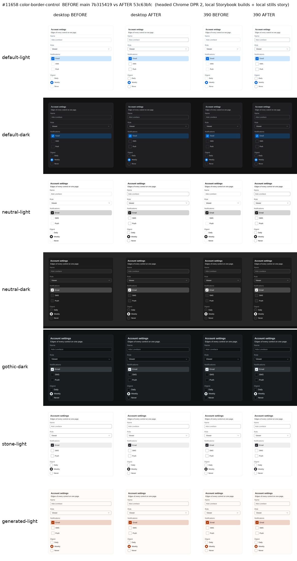
Measured control edge contrast against the card surface, before → after: Default light 1.51 → 3.35, dark 1.93 → 3.02; Neutral light 1.48 → 3.74, dark 2.20 → 3.85; Gothic dark 2.07 → 3.45; Stone light 3.72 → 3.72 (it already met 3:1); generated 3.08 → 3.42. Against the page body, see the theme table above. The Card border, the Divider, the surfaces and the body text are unchanged in every theme.
Butter and Y2K at this head (18d5d7f)
Same capture method; before is the merge base 7b31541. Contact sheet: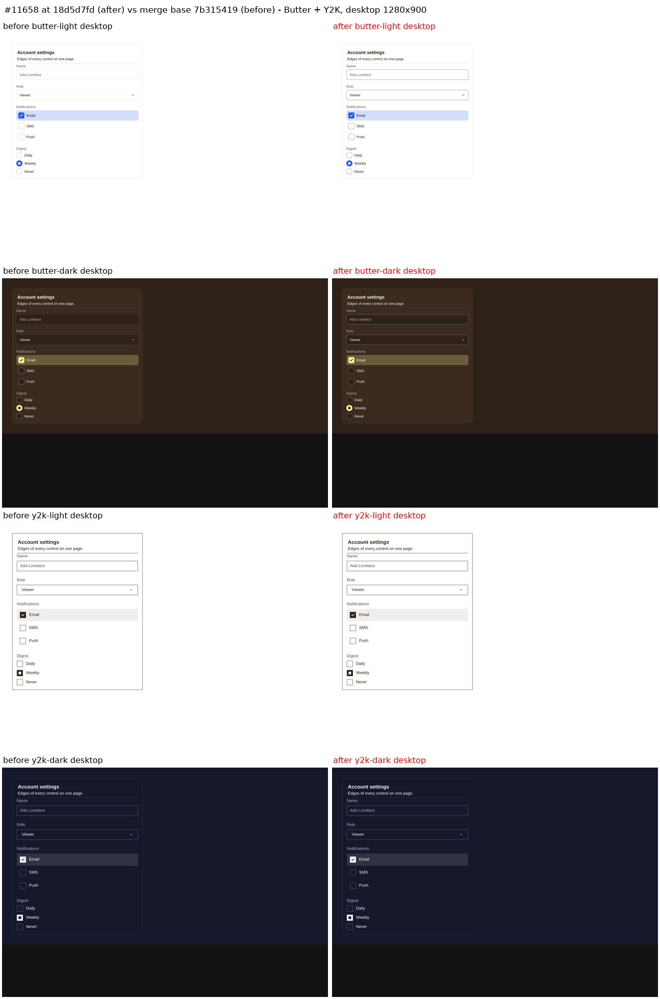
Writing rubric results
Two record lines change: Indicator FR5 (with its anatomy and evidence rows) and InputGroupText FR3. Each still states one present-tense fact about what the component draws, names the token that sets it, and adds no history, proposals or status.
pnpm check:knowledgepasses.Related
--color-border-emphasized). The owner chose a separate control role instead, so cards and dividers keep their lighter edge.Owner and land path